Why this change
Sineglossa was founded in 2014 out of a question: how can the work of artists and cultural professionals be recognized beyond the spaces of art?
That question hasn’t changed since then, but the ways and contexts in which we try to answer it have. We’ve grown the number of people we work with and the territories we move through; the projects we imagine together with artists, researchers, museums, universities, businesses and public administrations have become more articulated. Today Sineglossa has offices in Ancona, Bologna, Turin and Milan, coordinates European projects, is a partner in international consortia, supports cultural organizations in the use of data and artificial intelligence, and continues to experiment – through art – new ways of reading the present.
Read also
- Insights, News
Over time, we noticed this evolution was struggling to stay within the form – legal and visual – that we had built over the years.
Our legal form
The first transformation concerned our organizational form: Sineglossa has remained a non-profit association, but has now qualified as a Social Enterprise (Impresa Sociale). Our non-profit nature, mission and general-interest activities remain unchanged. What changes is our ability to sustain them over time. The previous form had served us well for a long time, but it was starting to limit an organization that, alongside funded projects, increasingly develops services, training programs and consulting for museums, universities, businesses and public administrations. Social Enterprise status allows us to diversify revenues, take part in tenders and respond to new requests without giving up opportunities for growth, while continuing to reinvest any surplus into our cultural and general-interest activities. It’s a structure better suited to Sineglossa today: a cultural research and production center which has grown in its people, its territories, and the complexity of the collaborations it builds.
A renewed visual identity
Alongside this administrative evolution, the second transformation involved updating our visual identity. The previous one, which had accompanied us since 2017, had over the years become one of the elements that made us most recognizable, which is why we didn’t rethink it from scratch, but simply brought it up to date, so it could represent what we have become. Today we engage with museums, schools, universities, businesses, public administrations, European networks, artists and researchers. Each project develops its own language, audiences and ways of communicating. The identity we had was struggling to hold that complexity.
The restyling, designed in-house, is a flexible, modular visual system. In the new logo, the pictogram and logotype have been rebalanced: they now share the same weight and alternate pointed strokes with rounded joins, building a shared language between mark and name.

Color roles have shifted too. Purple remains Sineglossa’s identity color; lime becomes a signal that guides navigation, highlights content and directs interaction. Around these two elements, a supporting palette makes the system more legible, balanced, and able to leave room for the projects themselves rather than overshadowing them.
The same principle guides the typography. Sagace, designed by type designer Alexandre Créquer, organizes and structures content. CSTM Xprmntl 02, developed by CSTM Fonts, introduces a more experimental voice. Two different typefaces reflecting a tension that has always run through Sineglossa’s work: between rigor and experimentation, research and contamination.
Francesca Tilio's gaze
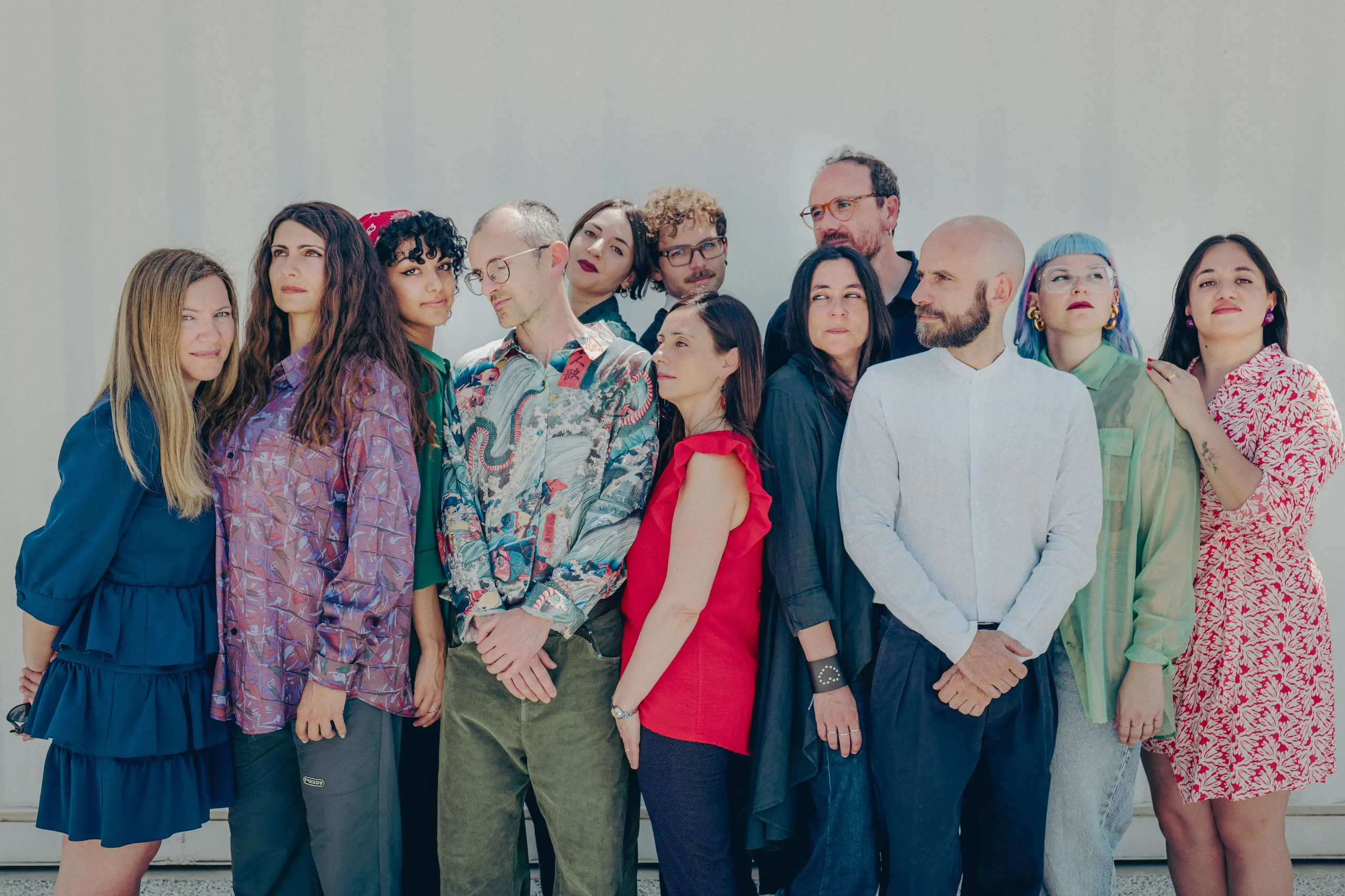
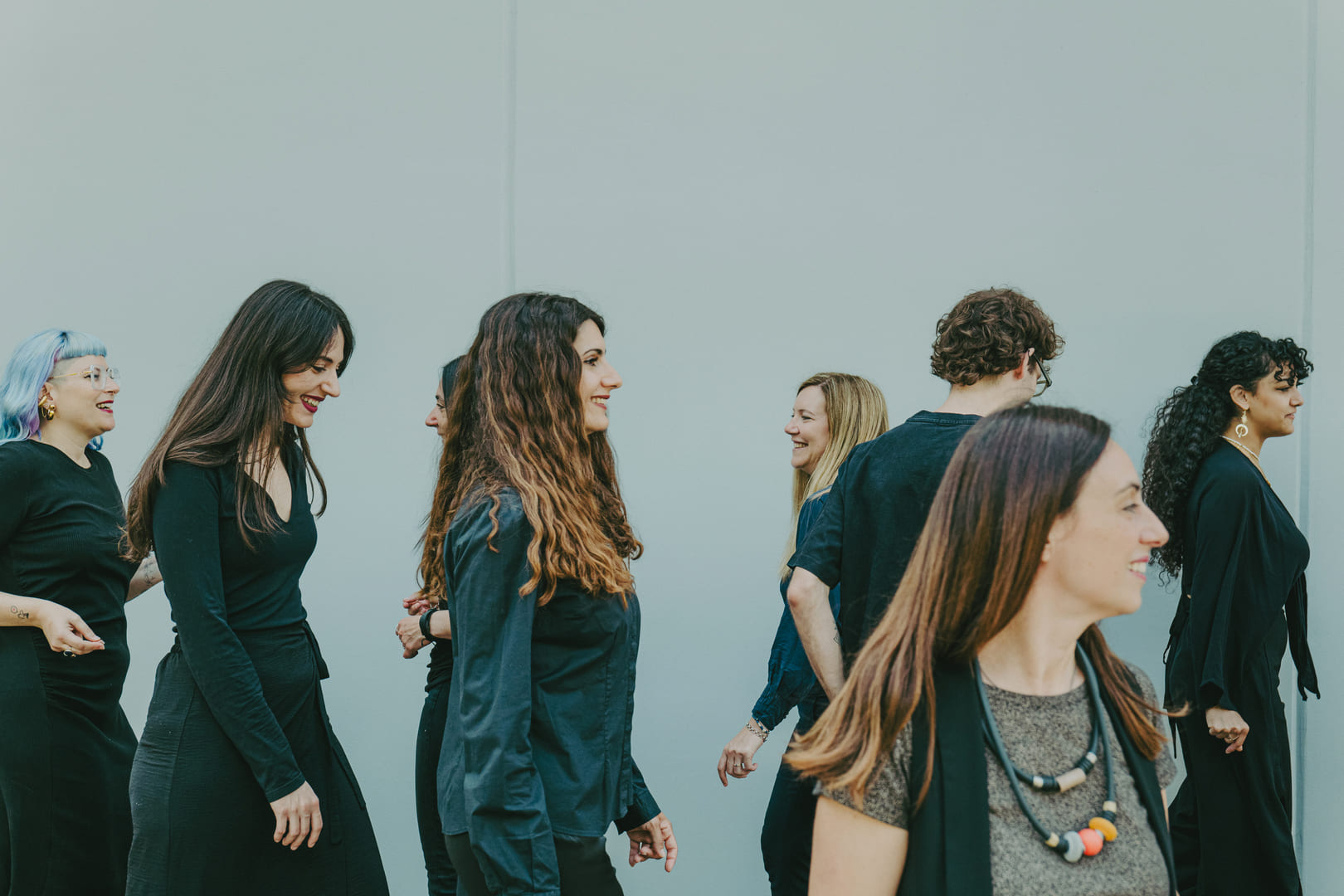
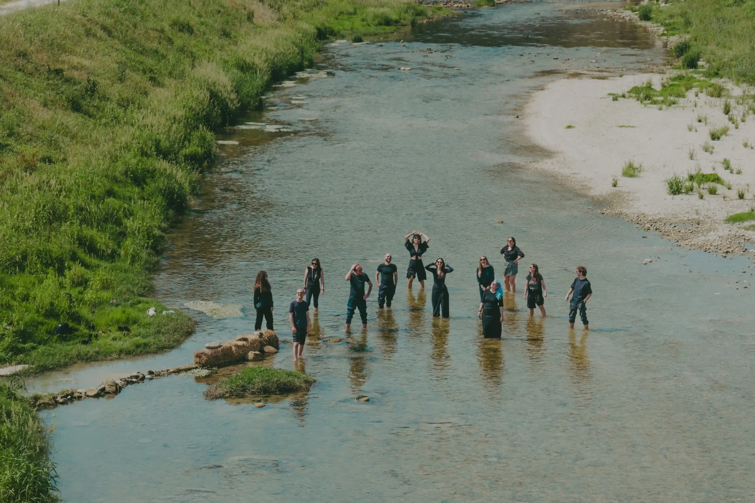
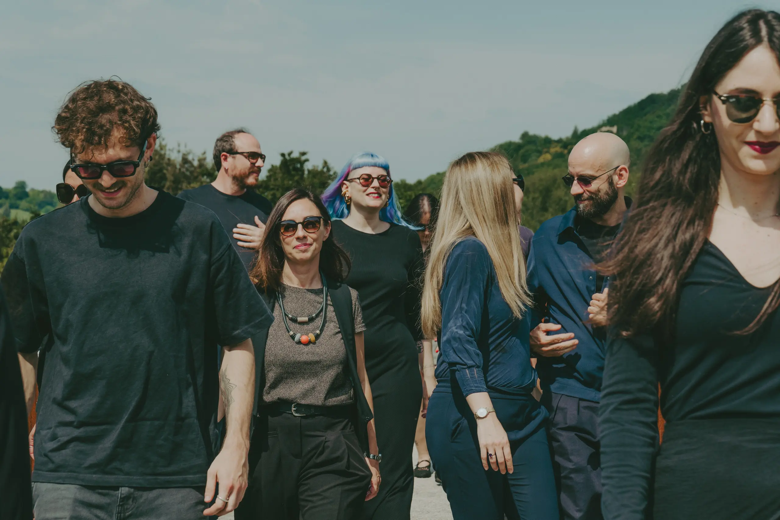
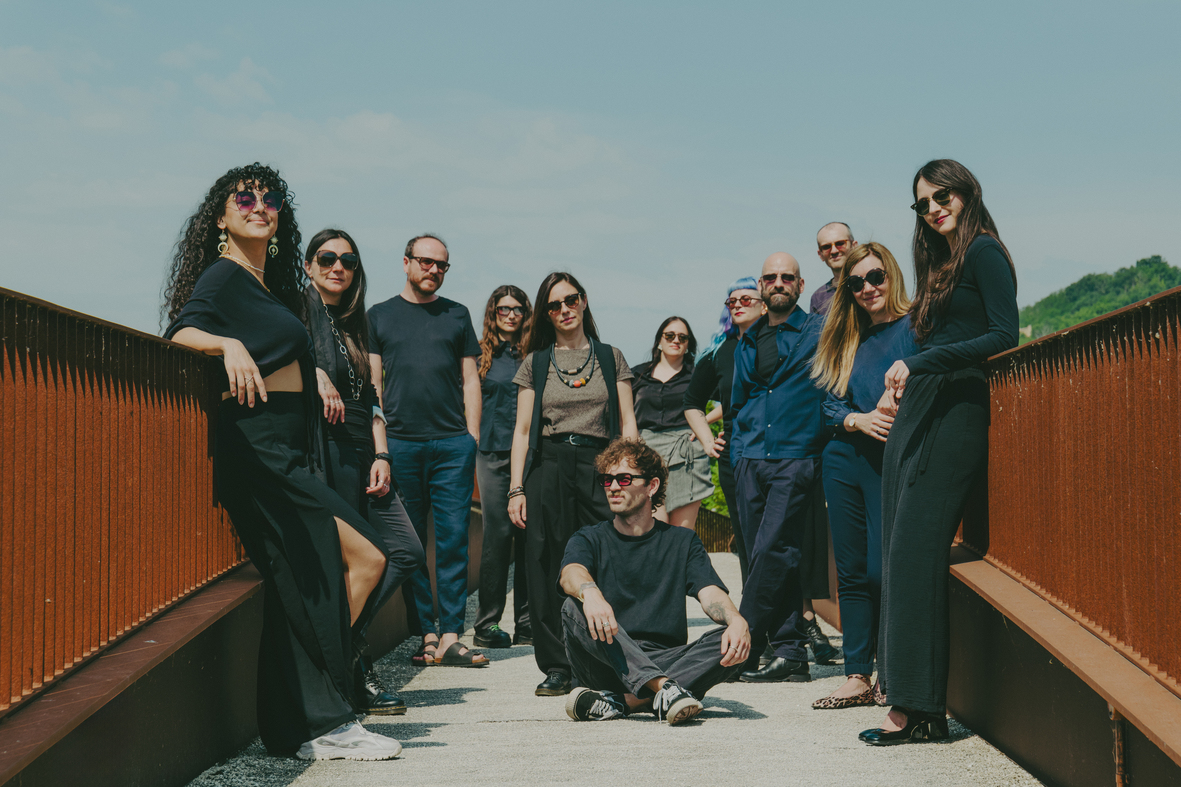
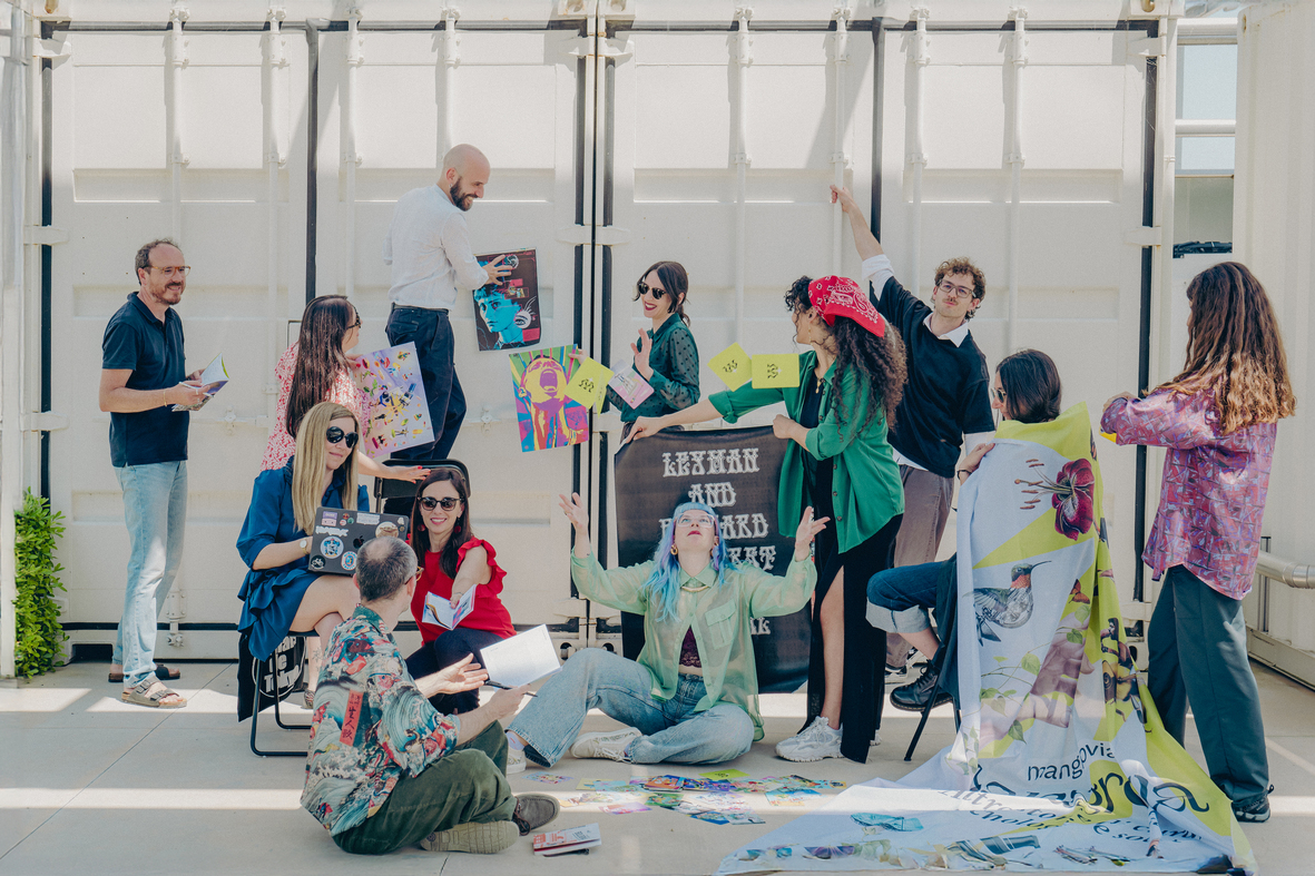
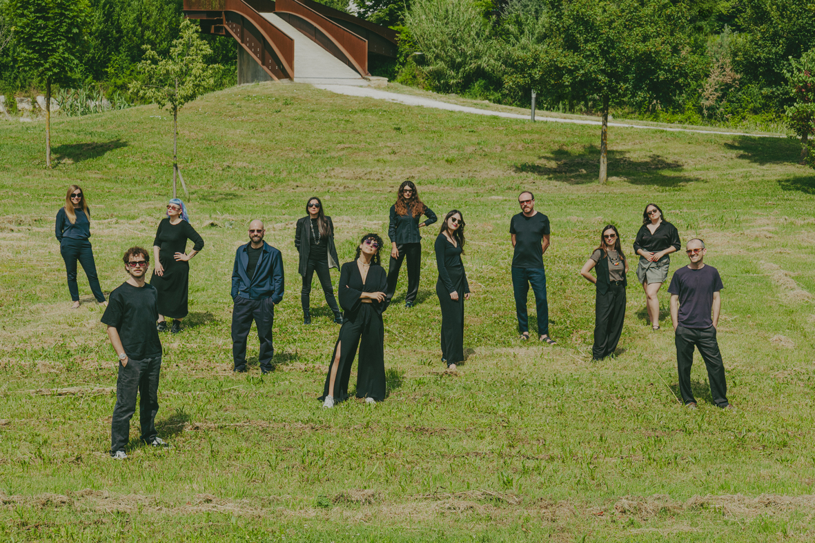
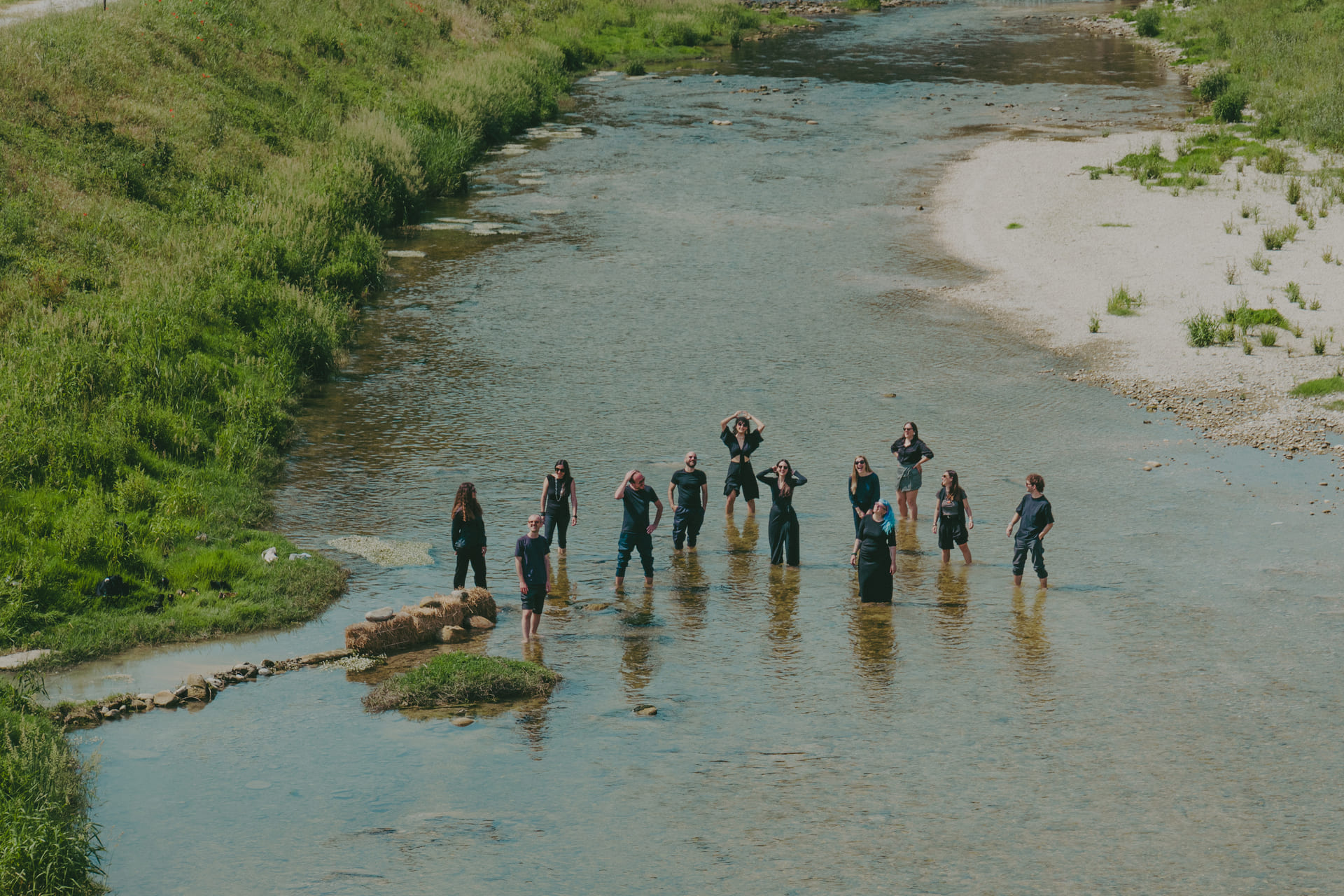
To mark this new phase, we asked photographer Francesca Tilio to create a new collective portrait of Sineglossa. We met at the Loccioni spaces, where we spent a day between conversations, work and shared moments. Before even photographing us, Francesca observed the way we collaborate, move, and build relationships. The images that came out of it tell not only who we are, but also how we work.